Get In Touch
Social Links
Welcome to the Blok Blok Studio blog — where we share ideas, insights, and strategies to help you grow, create, and innovate. Whether you’re looking for practical tips, industry trends, or fresh perspectives, you’ll find resources here to inspire your next move.
The internet isn’t actually held together by servers, cables, or AI overlords. It’s held together by details. The tiniest design flickers, the blink-and-you’ll-miss-it animations, the button that bounces back like it’s happy to see you. Those are micro-interactions, and while they rarely headline a brand deck, they’re the reason we keep scrolling, tapping, and, most importantly, staying.
Designers know this. Micro-interactions are the seasoning, the kick drum, the cutaway joke. Without them, even the prettiest website feels like an IKEA showroom: technically nice, but a little dead inside. With them, you get delight. Humanity. Stickiness. That sense that the brand is alive and maybe even flirting with you.
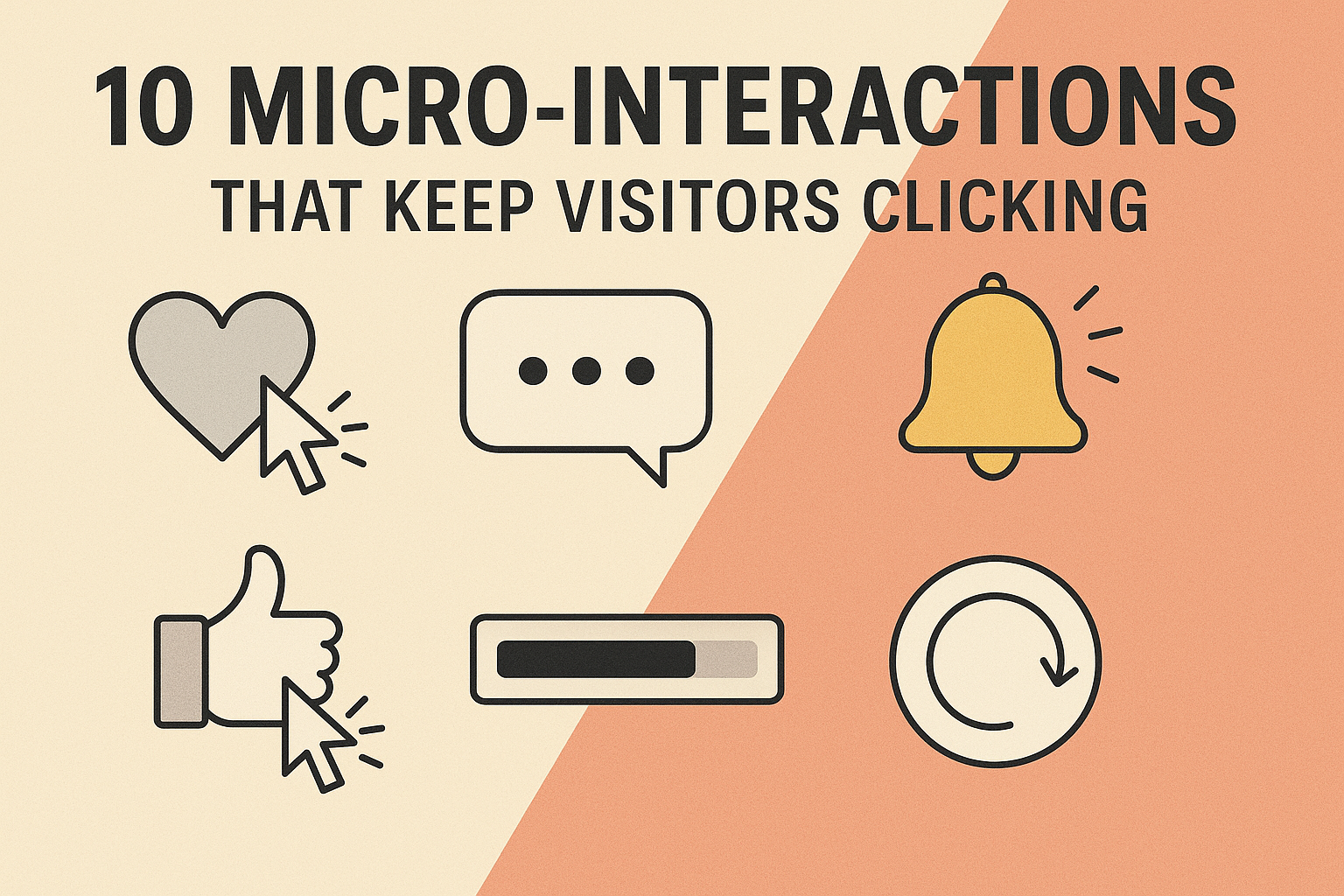
Here are ten micro-interactions that make visitors click, linger, and sometimes fall in love.
1. Hover Effects
You hover over a button and suddenly it lights up, grows, or shifts color — like a little wink across the room. It’s the smallest possible acknowledgement: yes, I see you. Apple’s product cards practically hum when your cursor glides over them, proof that minimalism still has a pulse when it knows how to glow.
2. Loading Animations
Nobody likes to wait. But if you must, you’d rather not stare into the void. Cue loading animations: spinners, bouncing dots, playful logos doing a quick stretch. Netflix’s pulsing red screen is iconic, TikTok’s delay feels like suspense. The best loading animations transform dead time into anticipation, like waiting for Beyoncé to step on stage.
3. Scroll-Triggered Reveals
Remember when The New York Times dropped its Snow Fall feature and suddenly scrolling the news felt like gliding through a documentary? That’s the power of scroll-triggered reveals. Text slides in, images fade up, background colors shift. It makes scrolling cinematic. Your thumb becomes a film reel.
4. Microcopy Easter Eggs
Words matter, especially the small ones. “Error 404” is a shrug; “Lost in the sauce” is a wink. Mailchimp built a whole identity out of this kind of playful copy. The submit button doesn’t have to say “Submit.” It can say “Make it happen,” “Beam me up,” or “Let’s go.” These aren’t just words, they’re moments of personality.
5. Button Feedback
Click a button and nothing happens? Anxiety. Click a button and it shrinks, pulses, or changes color? Relief. Feedback is emotional validation coded into design. It’s the equivalent of someone nodding when you speak — proof that you’re not just yelling into the void.
6. Swipe Gestures
Swipe left, swipe right. Tinder took a simple gesture and turned it into a global ritual. Now, brands have adopted swiping for everything: image galleries, product reveals, dismissals. The pleasure is in the physicality. It feels like turning a page or flipping through vinyl. Swipe gestures transform mobile from passive consumption into choreography.
7. Cursor Transformations
Your cursor doesn’t have to be boring. Designers are turning pointers into circles, glowing orbs, or even tiny text prompts. A basic arrow is a relic of the Microsoft Office era. A custom cursor says, “This site was designed for discovery.” It’s a small flex, but a powerful one.
8. Sound Cues
Used recklessly, sound is chaos. Used well, it’s dopamine. Slack’s gentle knock is iconic because it’s friendly, not alarming. A soft sparkle when you complete a task, a satisfying thud when you drag and drop — these sound cues create multi-sensory texture. Digital doesn’t have to be silent. Sometimes, it can sing.
9. Gamified Progress
Progress bars, completion circles, level-up animations. Humans are wired to finish what we start, which is why LinkedIn telling you your profile is “60% complete” feels irresistible. It’s manipulative, yes, but also motivating. Even Duolingo’s passive-aggressive owl knows the power of gamified progress. (Miss a day, and he’ll come find you.)
10. Delightful Exits
Most brands obsess over the entrance — the homepage, the landing page, the CTA. Few think about the exit. But what happens when someone leaves your site? A playful sign-off, a cheeky animation, or even a “See you soon” note makes departure feel less like abandonment and more like a see-you-later. Exits are encores, and the best shows never skip an encore.
So, why do they matter? Because people rarely fall in love with brands for the big things. They fall in love with the details — the Easter egg that makes them laugh, the hover that makes them feel seen, the animation that makes waiting bearable. Micro-interactions are what separate “usable” from “magnetic.” They’re the difference between a billboard and a conversation. A billboard tells you something. A conversation listens, reacts, and occasionally surprises you. That’s what these little moments are: digital listening, coded empathy.
So yes, pour energy into the big campaigns, the glossy imagery, the bold copy. But don’t forget the tiny flickers that make a site feel alive. Because in 2025, behavior is brand. And behavior is built on micro-interactions.